
Contents
The brief
The CRM-ERP.LV onepage website is a single-page site with our design that CREATING.LV built for a CRM/ERP system: it was created for an exhibition and for first contact with interested parties, while the full system website was being built in parallel. The CRM/ERP system itself is the client’s product, not a CREATING.LV development. The project was handed over in 2024.
In this situation, a single-page website solves a specific task: an exhibition visitor or interested party opens one address and quickly understands what the system does, who already uses it and how to book a conversation.
Our role
CREATING.LV built the CRM-ERP.LV single-page website on WordPress. Our work covered:
- the visual design and user flow;
- the page blocks — the opening view, advantages, clients and contacts;
- a contact form for enquiries from interested parties;
- an adapted mobile version.
We did not develop the CRM/ERP system itself. The project manager for the CRM/ERP system was Inga Jākobsone, working in another company’s team. That role concerned the system itself, while CREATING.LV’s work in this project was the single-page website. The page content is easy to update, and the page was intended for use at exhibitions and in digital communication until the full website was launched. In digital communication, a single-page website is convenient because its address can be given in an email or another channel, and every recipient lands on the same page with the same sign-up form.
Project views
 — enlarge image
Home page 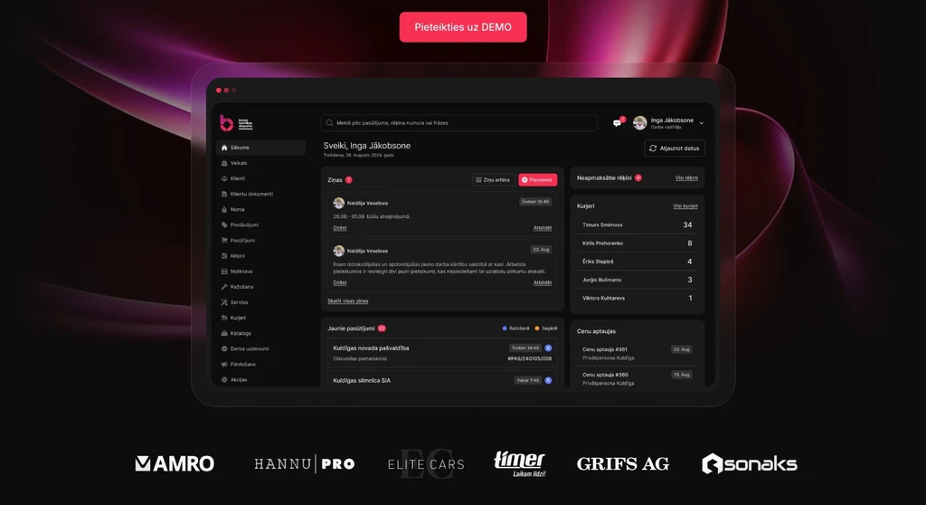 — enlarge image
System dashboard presentation 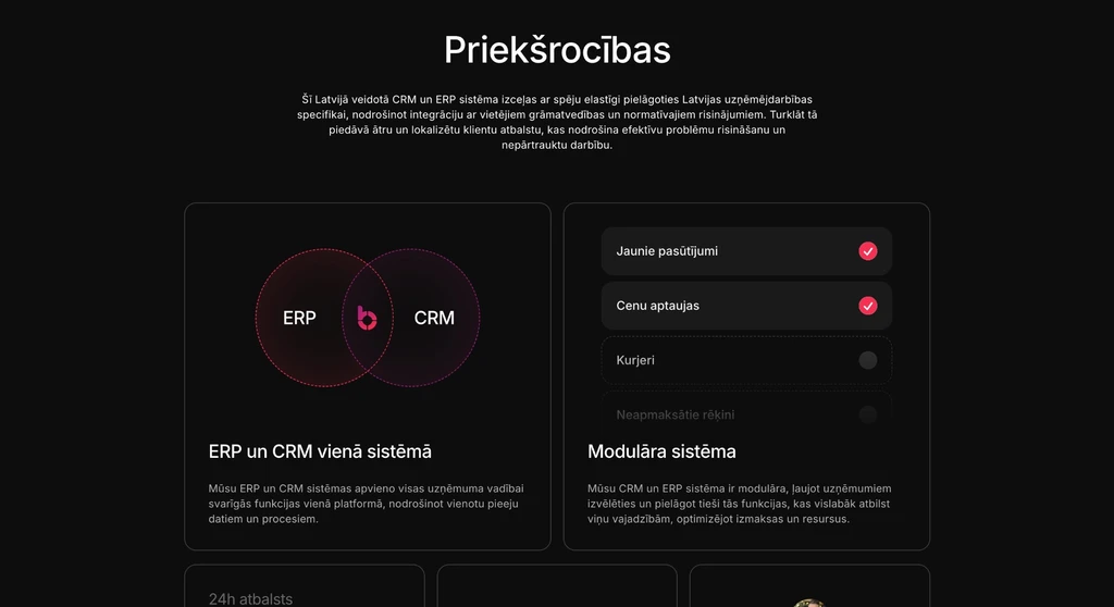 — enlarge image
System advantages 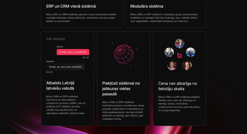 — enlarge image
Feature cards 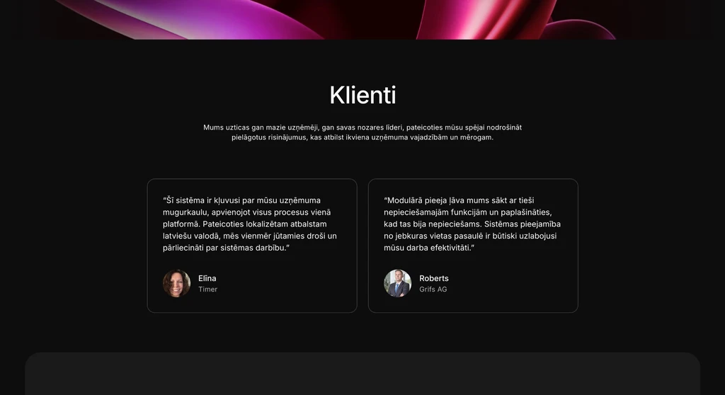 — enlarge image
Clients section
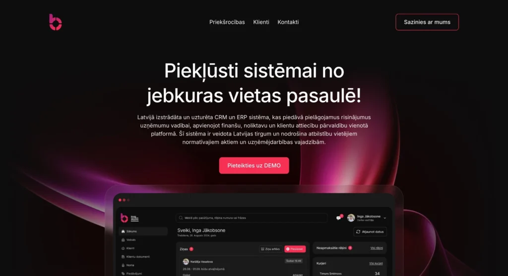
Opening view with an invitation to book a demo
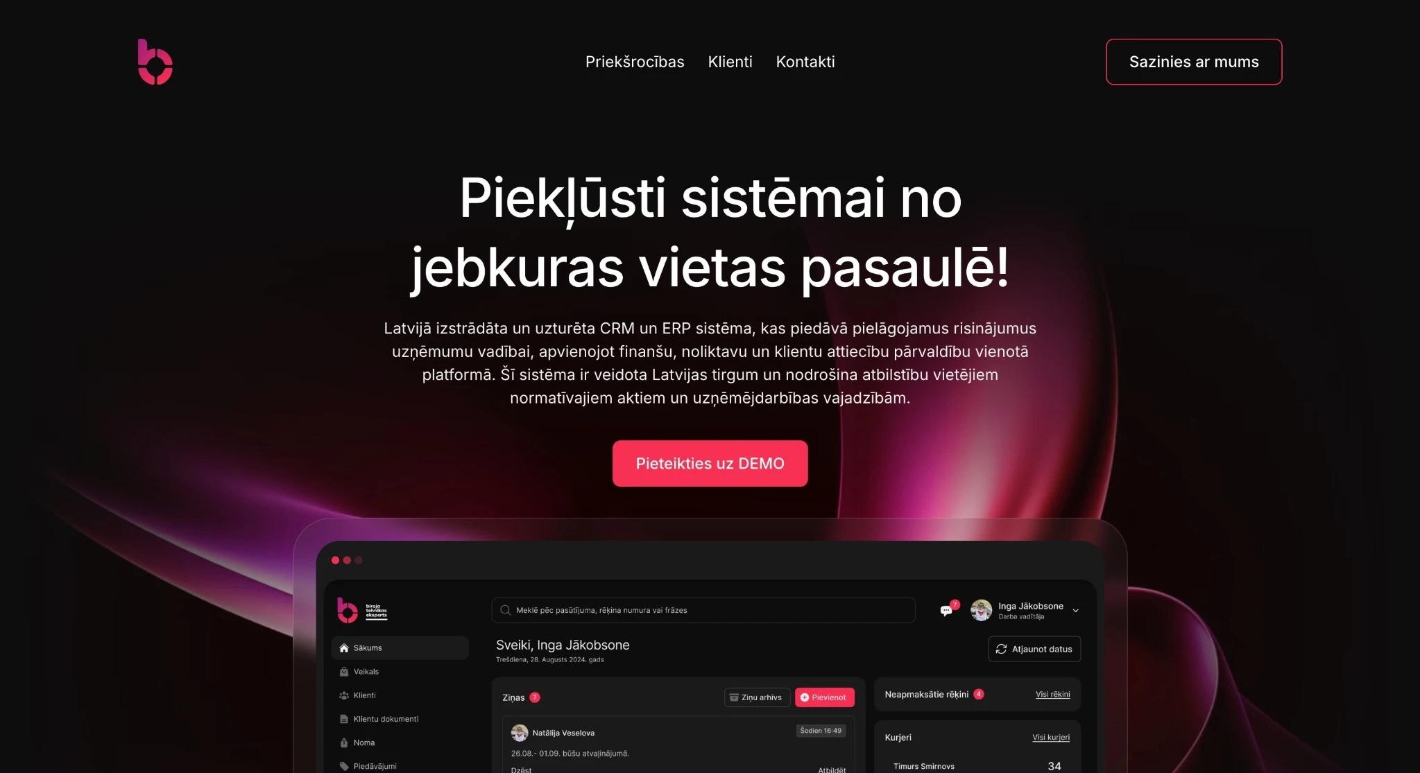
At the top of the page there is a short menu with the anchor links Advantages, Clients and Contacts. The opening view has a “Pieteikties uz DEMO” (Book a demo) button.
The anchor links in the menu take visitors straight to the block they need, so even longer single-page content is easy to scan. The order of the page matches how an interested party makes a decision: first the main message, then the advantages, then the clients and finally contact.
The “Book a demo” button in the opening view is for visitors who have already heard about the system, for example at the exhibition stand, and want to sign up for a demonstration straight away. They do not have to scroll the whole page to find where to do so.
System advantages block
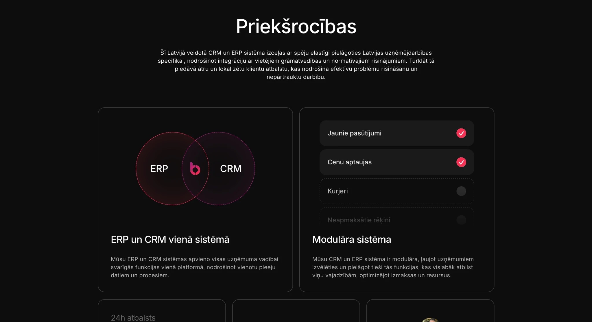
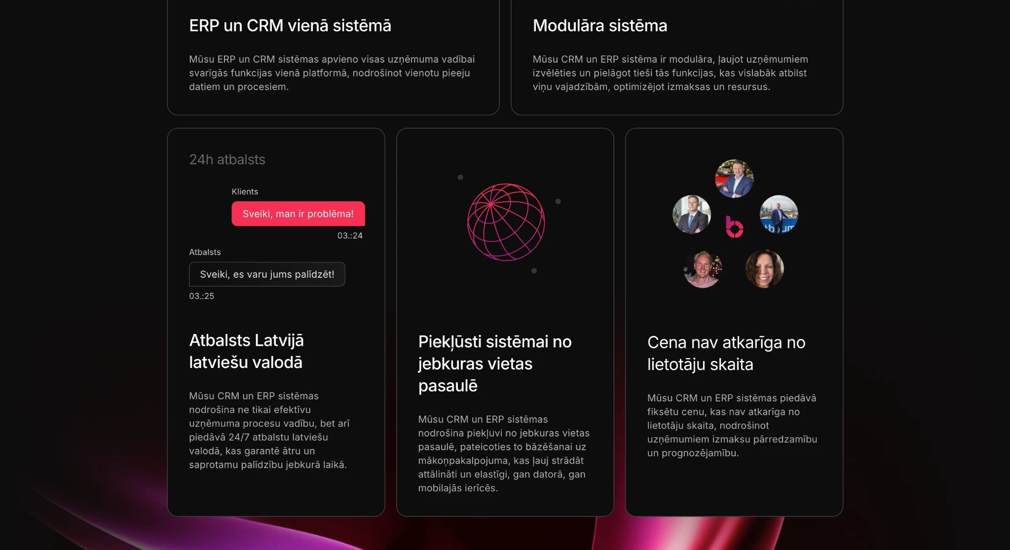
The advantages block helps visitors quickly understand what the system does and what problem it solves. The advantages are shown in separate cards with a short heading and an explanation; the card texts are the client’s own wording about their product. The card headings include, for example:
- “ERP and CRM in one system”;
- “A modular system”;
- “Support in Latvia in Latvian”;
- “Access the system from anywhere in the world” — without installation on a computer;
- “The price does not depend on the number of users”.
The card format lets each advantage be read separately. A business manager comparing several systems can quickly find the point that matters to them, for example the pricing principle or support in Latvian, without reading a long description.
Clients already using the system
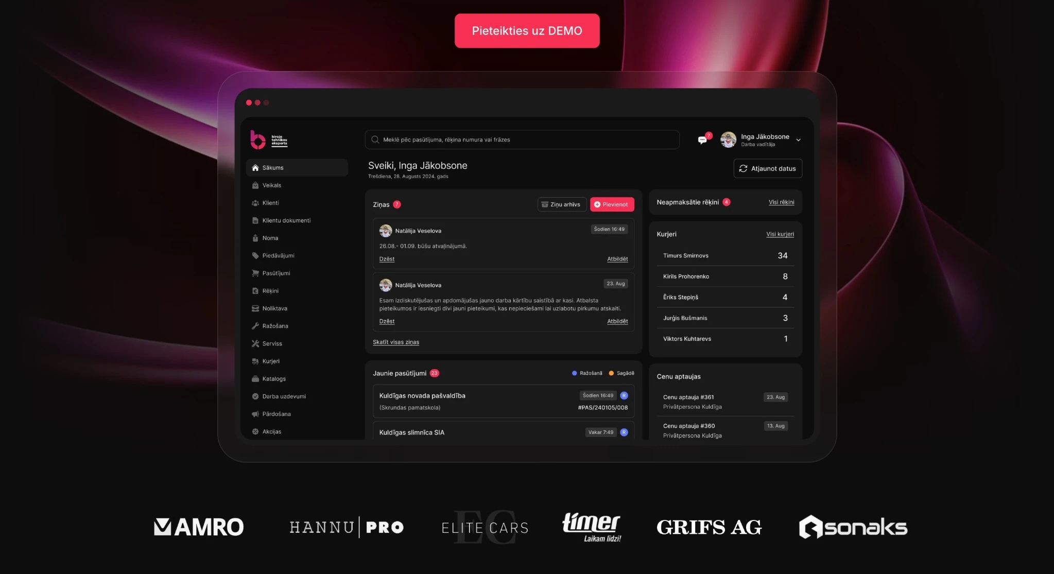
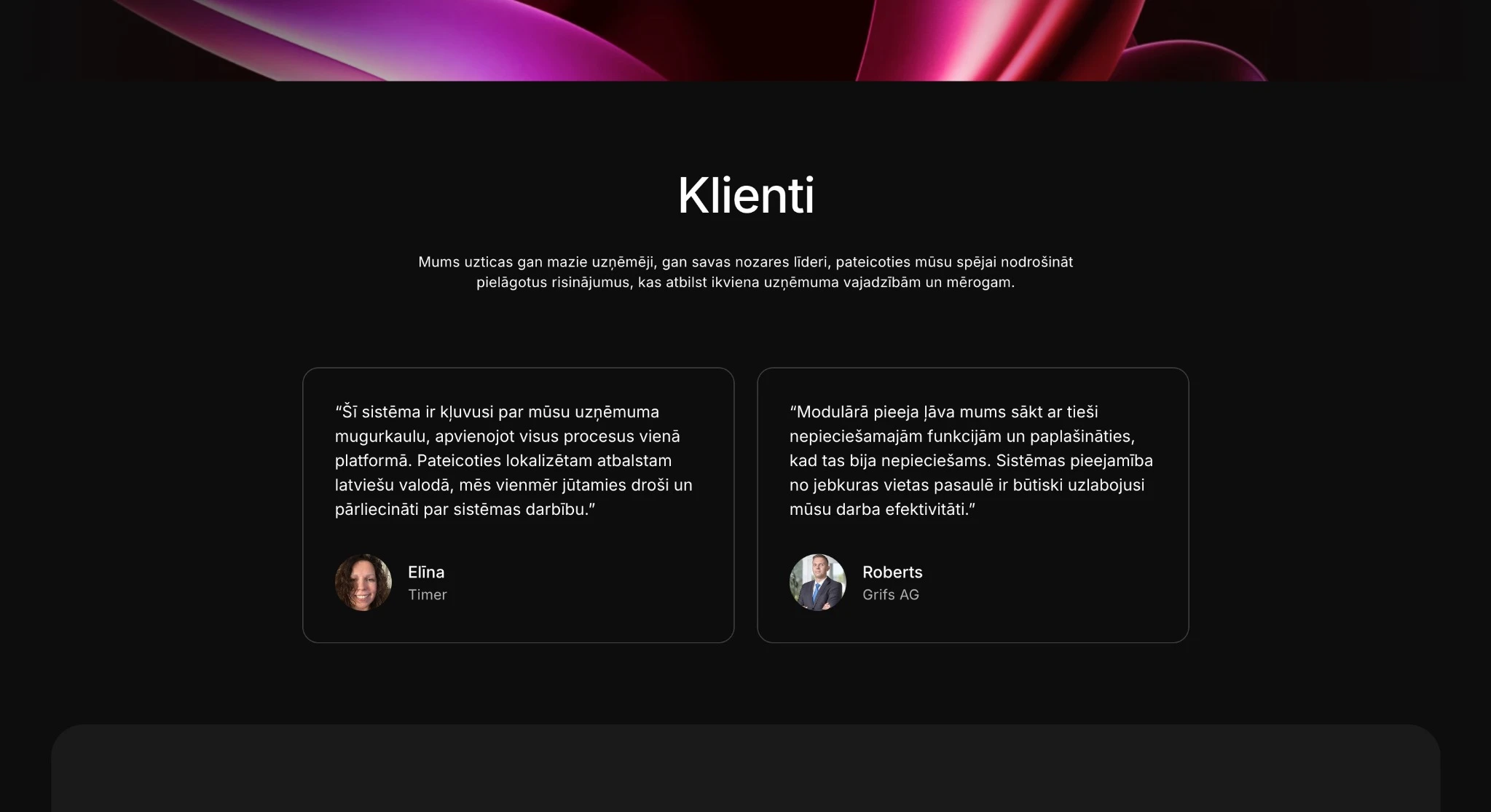
The next block has a strip of client logos and a layout of review cards. The block sits between the advantages and the contact form, so before enquiring, interested parties see that other companies already use the system.
The logos make it easy to recognise familiar company names quickly, while the reviews show how the system’s users rate it.
When planning a similar page, it is worth agreeing the publication of client logos and reviews with the clients themselves in good time, because these are their brands and their employees’ names.
The contact form as the first point of contact
At the end of the page there is a simple contact form: first name and surname, phone, email and company name. The company name field immediately shows which company the enquiry comes from, and the form serves as the first point of contact for those who want to join or receive more information.
The form has only four fields — for a first contact, it is enough for the system’s representative to be able to get in touch with the interested party. The phone number allows a call to arrange a demonstration, and the email allows more information to be sent. A short form can also be filled in at an exhibition, standing by the stand with a phone in hand. Questions about the company’s processes and the modules needed are not asked in the first form — they are easier to discuss in a conversation or a demonstration.
Form enquiries were sent by email. The recipient works with them like any other email: they can reply, call the phone number given or forward the enquiry to a colleague. During an exhibition this is convenient: enquiries filled in at the stand collect in the inbox, and after the exhibition each interested party can be contacted in turn.
Design and use on a phone
The visual design and user flow were our work. On a single-page website, the order of the blocks matters: each block answers one question, and the “Book a demo” button is visible in the opening view. We also built an adapted mobile version so that an exhibition visitor could open the page and fill in the form on their own phone.
Technologies
WordPress — the advantages, the clients block and the contact information can be updated in the WordPress admin panel without changing the page structure. This matters for a short-term page: if a new client needs to be added or an advantage text refined before the next exhibition, it can be done in-house without waiting for a developer. More about the platform in the article WordPress website development.
Why one page first, rather than the full site
A full website for the system needs more content and time, but an exhibition takes place on a set date. This page was the CRM/ERP system’s first public step: it made it possible to present the system while the full site was still being built, and it contained only the main message, the advantages, the clients and contact.
Who a onepage website suits
A onepage website suits a product or service that quickly needs a page with the main message and a contact form for an exhibition, a launch or a campaign while the full website is being built. It also works if the offer can be explained in a few blocks. There is a limitation to keep in mind too: a onepage website has little room for content, so it does not answer all the questions people use to find the product in search engines. If the product needs separate pages about modules, industries or prices, the next step is the full website — as in this project, where it was built in parallel.
Onepage website development needs less content than a multi-page site, and the structure is simpler. The differences between a single-page and a business website are explained on our website development service page, and design work on the page web design. A similar project is the Printstone single-page website for a start-up.
Services we used
Note
This portfolio entry reflects the solution as delivered at handover. The current website may have changed.