
Contents
The brief
A WordPress website for the media agency MEDIA UP in the United Kingdom: CREATING.LV built the agency a clear English-language website that shows clients its services and lets them get in touch. The project was handed over in 2021.
MEDIA UP works on media strategies, advertising campaigns and digital marketing; the website gives the name B4 MEDIA UP. Its range of services is wide — from editorial content and live broadcasts to advertising, digital solutions and business consulting — so the main task was to organise this range so that visitors can take it in rather than getting lost in a long list.
Our role
CREATING.LV built the agency’s website on WordPress. This WordPress website for a media agency covered:
- the visual design and user flow;
- separate sections for the agency’s services by area;
- a contacts part with a map and a contact form;
- an adapted mobile version.
The website is in one language — English. This matches the agency’s audience in the United Kingdom, and a single-language site does not need translations or a language switcher to be maintained.
Project views
 — enlarge image
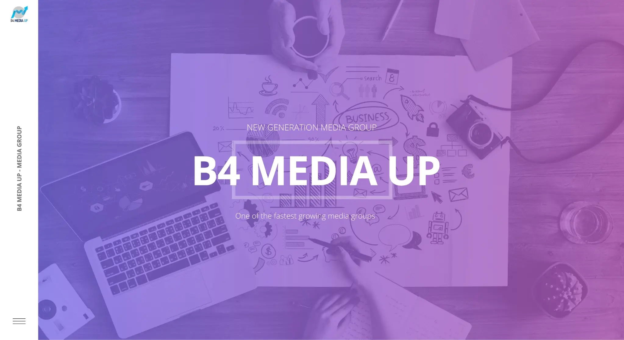
Home page 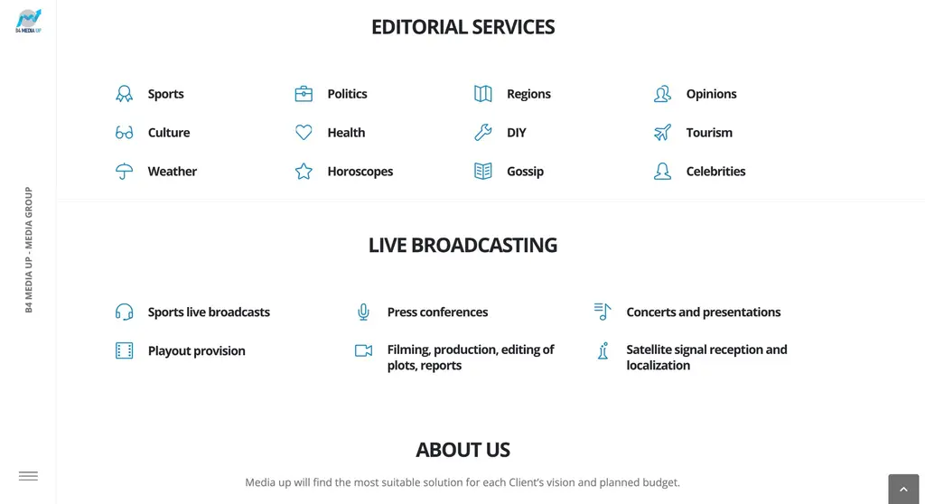 — enlarge image
Editorial and live broadcast services 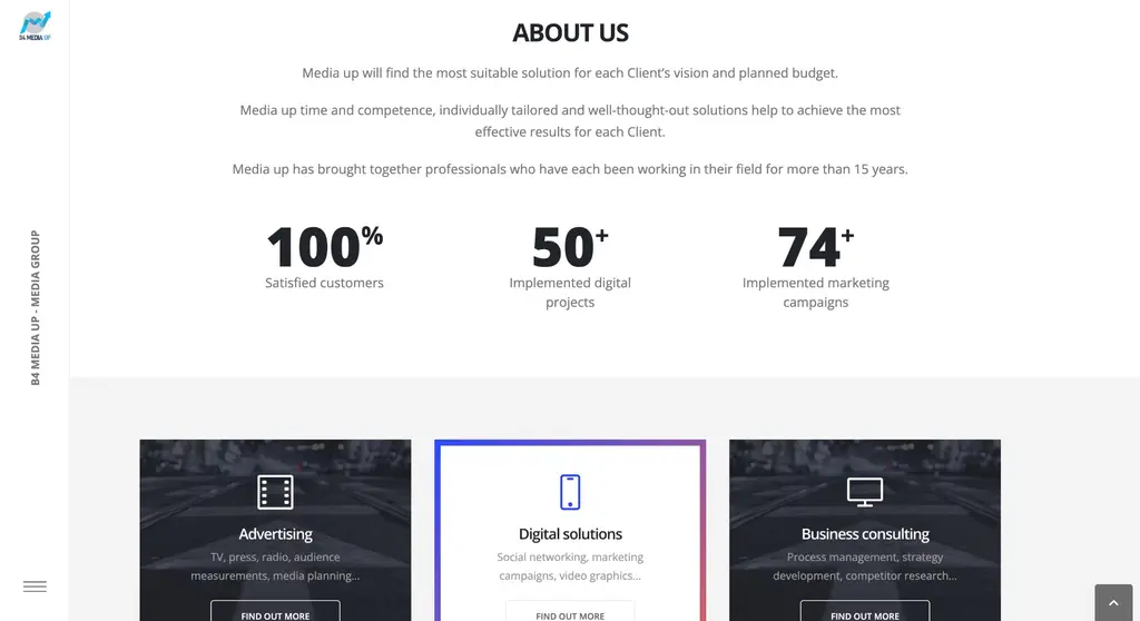 — enlarge image
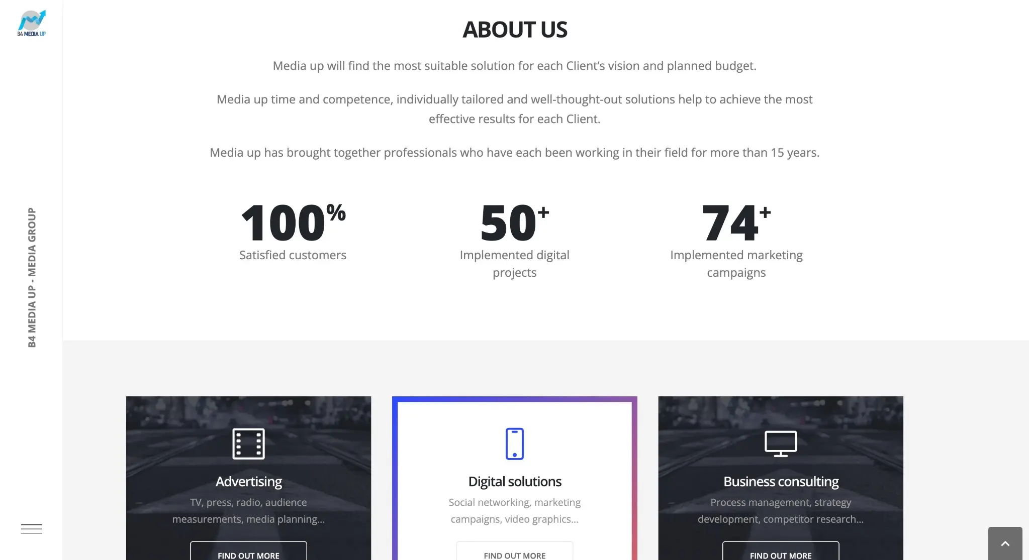
About the company 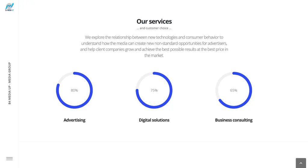 — enlarge image
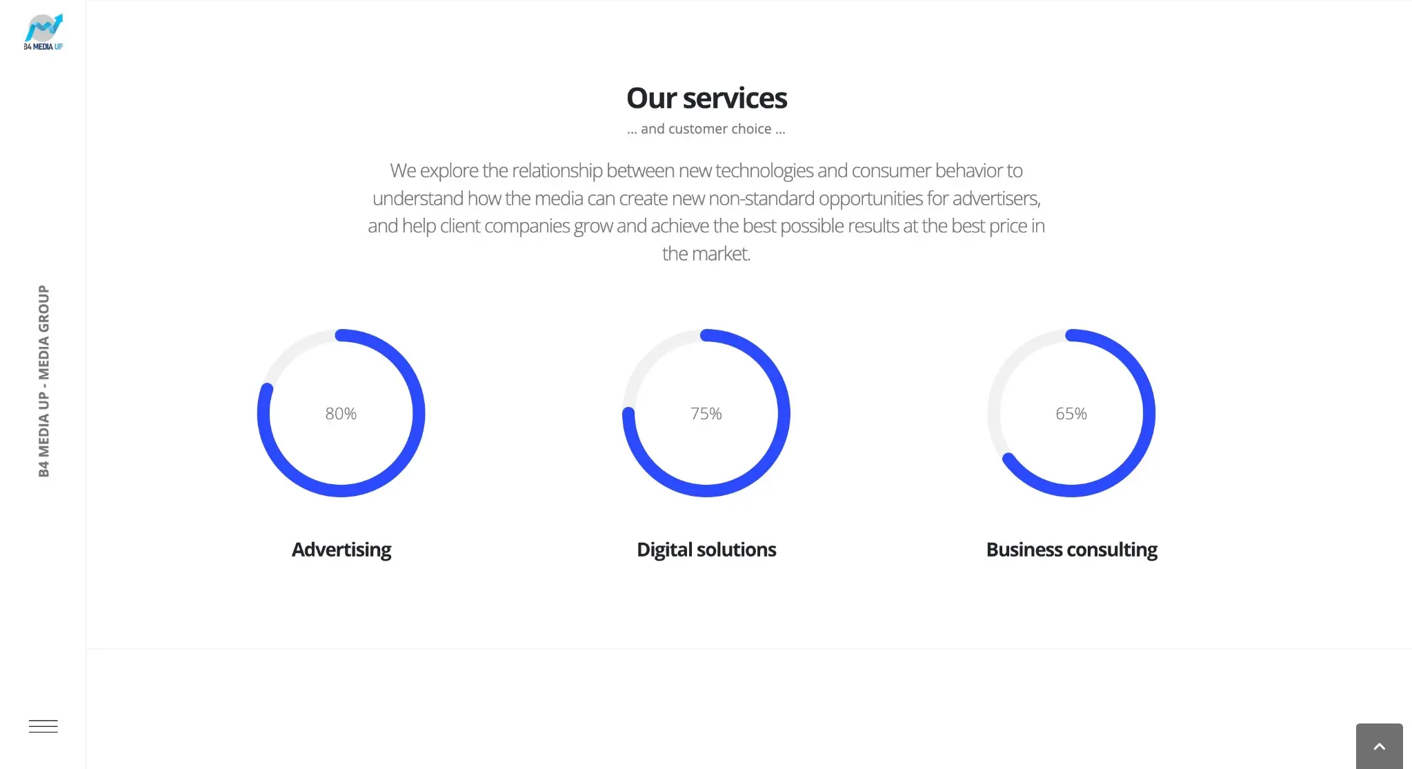
Services overview 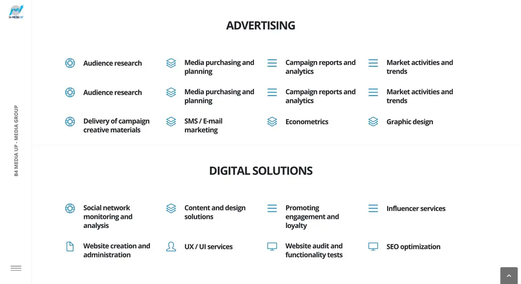 — enlarge image
Advertising and digital solutions 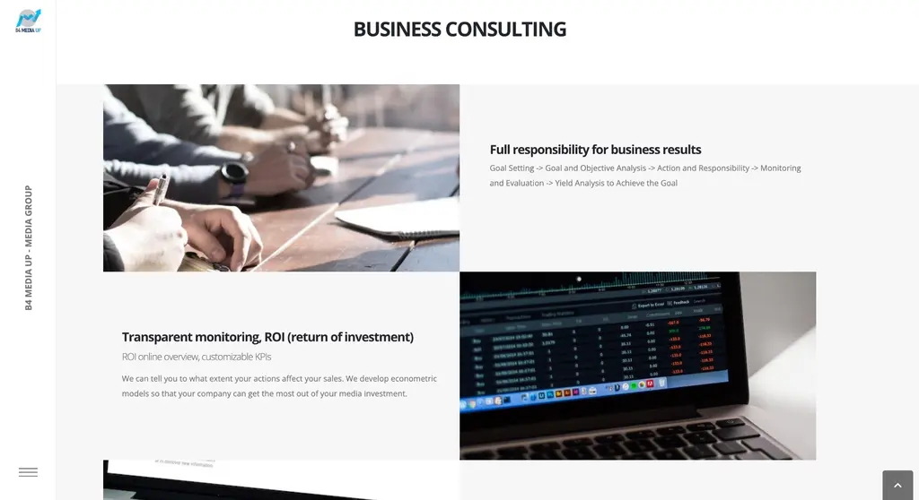 — enlarge image
Business consulting 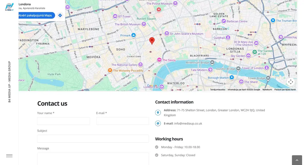 — enlarge image
Contacts section 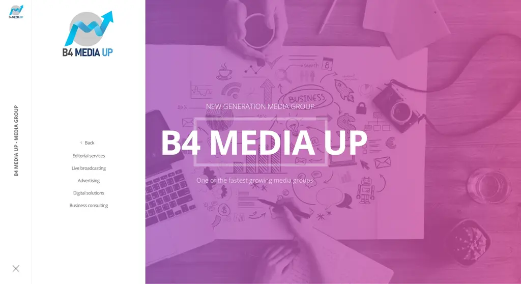 — enlarge image
Open navigation
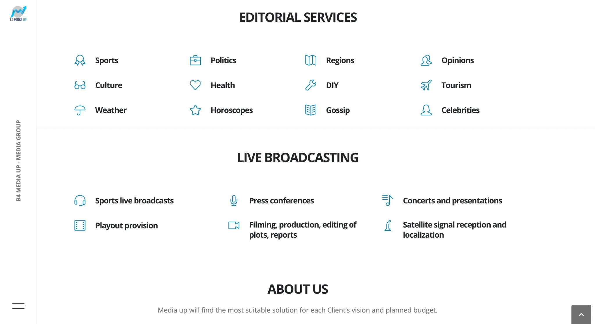
Service sections by area
Each service area has its own block with icons and short names. The editorial services block lists topics such as sport, politics, regions, culture and tourism, while the live broadcast block lists sports broadcasts, press conferences, concerts and video production.
Icons and short names let visitors quickly see which topics and formats the agency covers. For example, a sports organiser immediately sees in the live broadcast block that sports broadcasts are part of the agency’s offer, and does not have to read a long description to find out. The icon serves as a visual marker that visitors recognise while scrolling, while the short name specifies which topic or format is meant.
Three main areas in cards
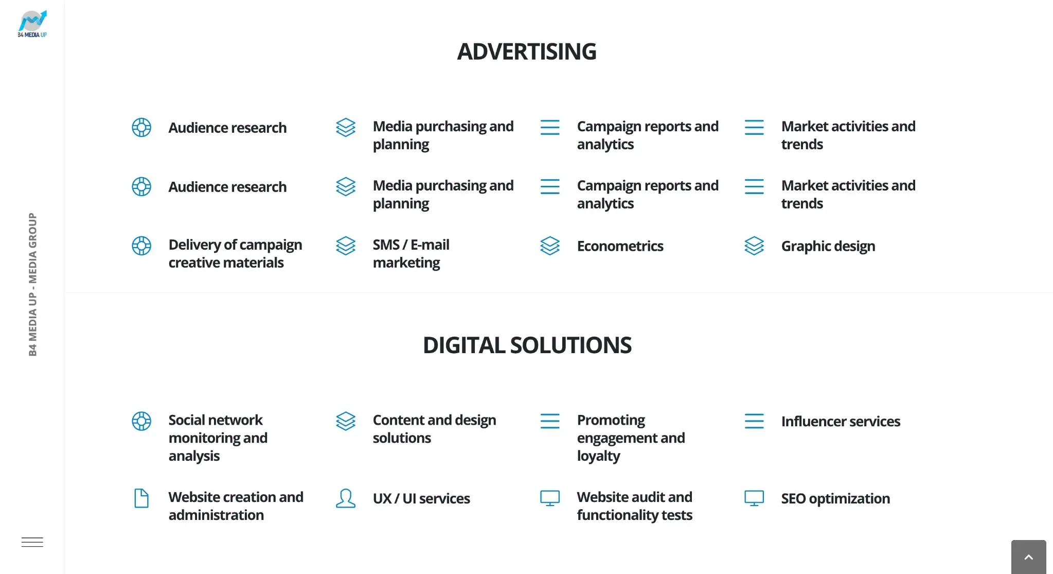
The three main areas — advertising, digital solutions and business consulting — are shown as cards with a “Find out more” button. The card titles on the site are in English: Advertising, Digital solutions and Business consulting. Each area then has an expanded list, for example audience research, media planning, social media monitoring and content solutions.
The card format divides the information into two levels. First, visitors see only three areas and choose theirs, and only then read the detailed list. This way many services can be shown on one page without overloading the first impression.
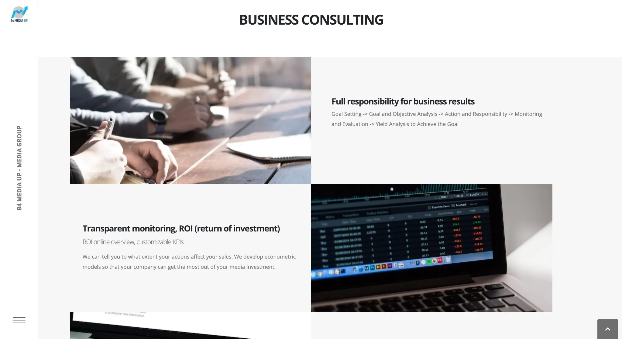
In the business consulting part, text and images alternate row by row: results monitoring, buying and selling TV content, sponsorship. This rhythm lets a long service description be read in parts, and each image marks the start of a new topic.
Contacts and the path to an enquiry
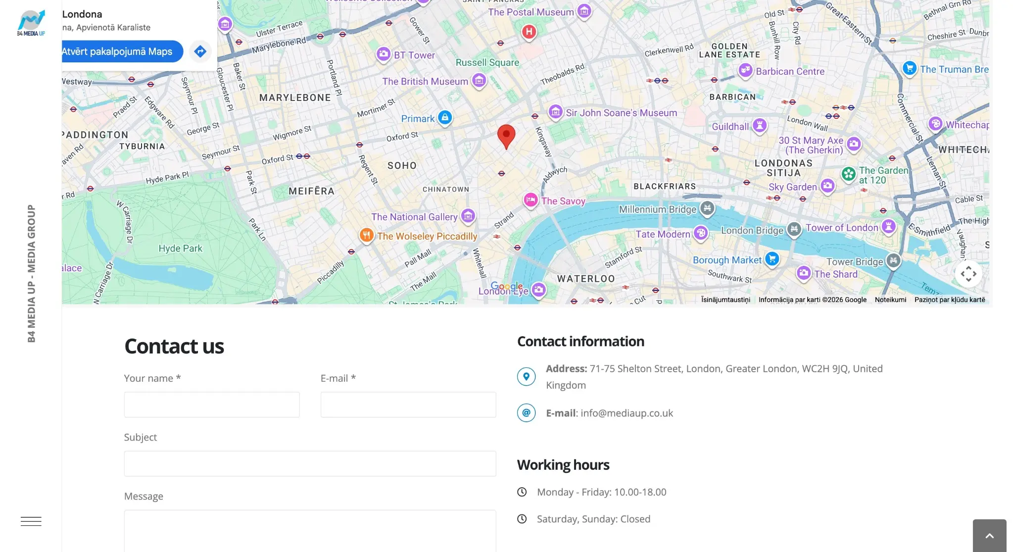
At the end of the page there is a map with the office location in London, a contact form with name, email, subject and message, as well as contact details and opening hours.
Each element of the contacts part has its own practical job. The map shows where the office is and is useful for clients planning an in-person meeting. The opening hours show when to expect a reply. The form’s “subject” field lets people state in their first message which service they are asking about, so it does not have to be clarified in a separate exchange.
A potential client moves through the website from the general to the specific:
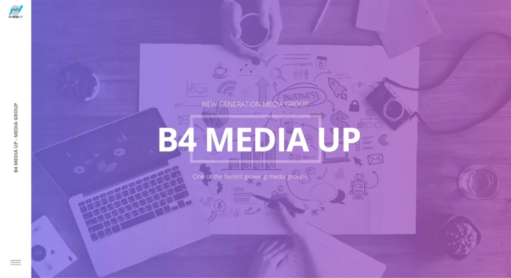
- in the opening view they see the agency’s name and a short message;
- scrolling, they reach the editorial services, live broadcasts and a short description of the agency in the “About us” block;
- in three cards they choose an area and read the expanded list;
- at the end of the page they find the map, opening hours and a contact form for an enquiry.
Design and navigation
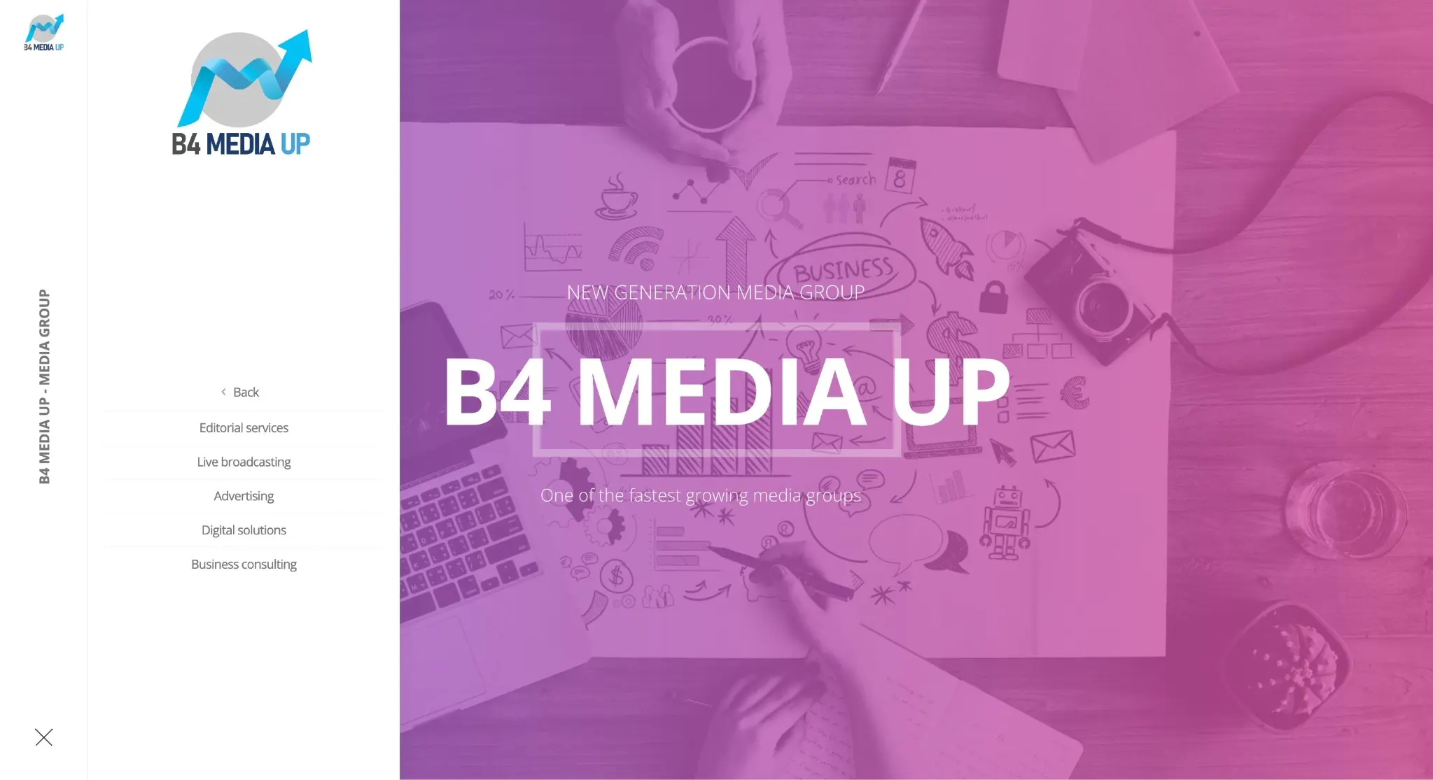
The visual design was our work. The navigation is placed in a narrow side bar with a menu button, so it stays accessible even on a long page, and the large opening image shows the agency’s name straight away.
The menu opens only when the visitor presses the button, so the side bar takes up little space and leaves most of the screen for the content — the opening image, the service blocks and the cards.
The many services are divided into uniform blocks with icons, cards and lists, so a website like this lets visitors of a media agency quickly scan all the areas and open only what interests them. A uniform block design also means visitors look for information in the same place in every area.
Mobile version
An adapted mobile version was built for the website, and this too was our work. The mobile version is designed so that blocks, cards and lists are readable on a phone screen when scrolling, without zooming. An adapted mobile version means that elements placed side by side on a desktop are arranged differently on a narrow screen, usually one below the other, and spacing and text size are adjusted for them too. The contact form and contact details are also available on a phone, so an enquiry can be sent from any device.
Technologies
The website was built on WordPress. More about choosing this platform in the article Why WordPress is the best choice for your website.
Who a WordPress website for a media agency suits
This kind of solution suits a media, advertising or marketing agency that needs to present many different services. The same structure — area blocks, cards with expanded lists and a contacts part at the end of the page — also suits another service company with a wide offer. Before development, it helps an agency to organise its services by area and prepare a short list for each area — the structure of the blocks and cards follows from this. A media agency website with clearly separated service areas helps clients quickly understand in which area the agency can help.
A single-language website for a media agency suits cases where the agency’s clients mainly use one language. If clients speak different languages, the site needs language versions, and on a multilingual WordPress site a translation has to be maintained for each page too; more about the tools in the article WPML or Polylang.
A WordPress website for an agency with an international audience also needs a clear contacts part: the address, opening hours and a form in one place. If you are planning a similar site, take a look at our website development and web design services.
Services we used
Website
Note
This portfolio entry reflects the solution as delivered at handover. The current website may have changed.