
Contents
The brief
The PRX Pharmax WordPress website was built around a clear structure: CREATING.LV created an English-language website for a pharmaceutical products distributor in which product groups, services, countries and contact are separate blocks, most of which lead on to detailed information.
PRX Pharmax works in the pharmaceutical industry — the company is engaged in the distribution and logistics of pharmaceutical products. It needed a website that gives international clients accurate information about its products and services. This pharmaceutical company website is in English only.
Our role
CREATING.LV built the website on WordPress: the visual design, user flow and adaptation for use on desktop and mobile devices. The website was built so that the company can manage its content itself. The project was handed over in 2024. Security solutions, server settings, caching, SEO and site maintenance were not part of our scope of work. The site footer says “Site created by SIA CREATING.LV”.
The scope of work:
- visual design and usability;
- the menu and page structure;
- product group, country map and services blocks;
- a contact form with country and area of interest selection and reCAPTCHA;
- a news section;
- adaptation for desktop and mobile devices.
Project views
 — enlarge image
Home page 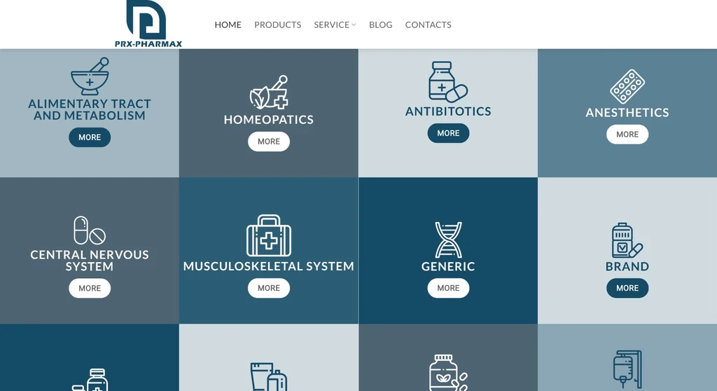 — enlarge image
Product groups 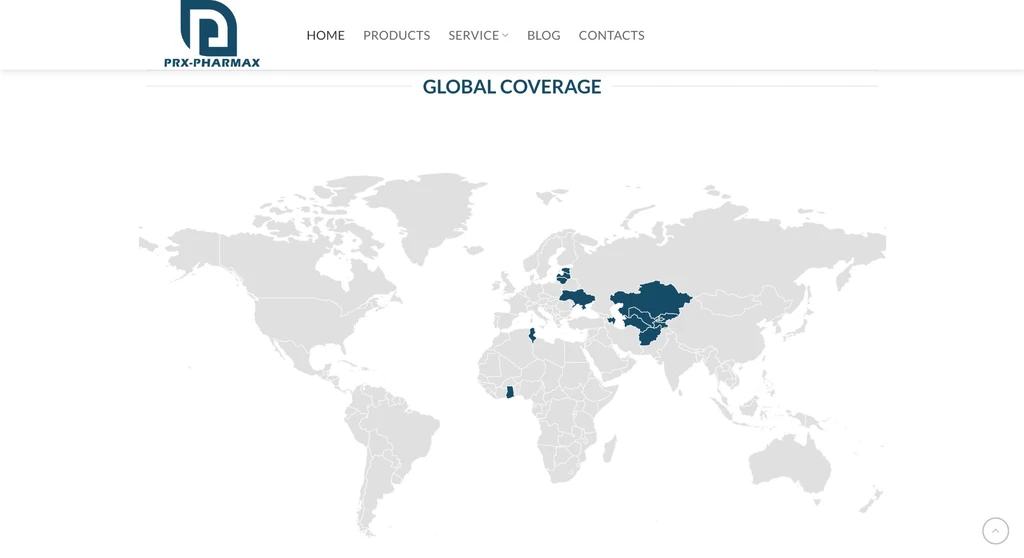 — enlarge image
Geographical coverage 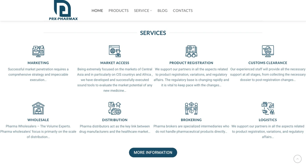 — enlarge image
Services 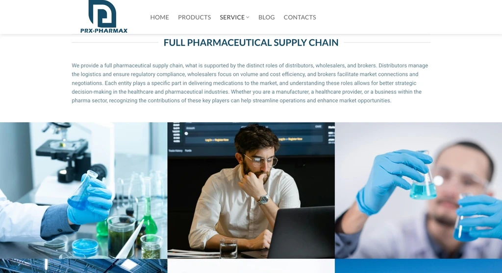 — enlarge image
Pharmaceutical supply chain

The website’s structure
The main menu has five sections: Home, Products, Service, Blog and Contacts. Each answers one visitor question — what the company offers, what services it provides, what’s new and how to get in touch. On the home page these topics are shown briefly, and in the sections in more detail, so visitors can start with an overview and open only what they need.
Product groups with icons
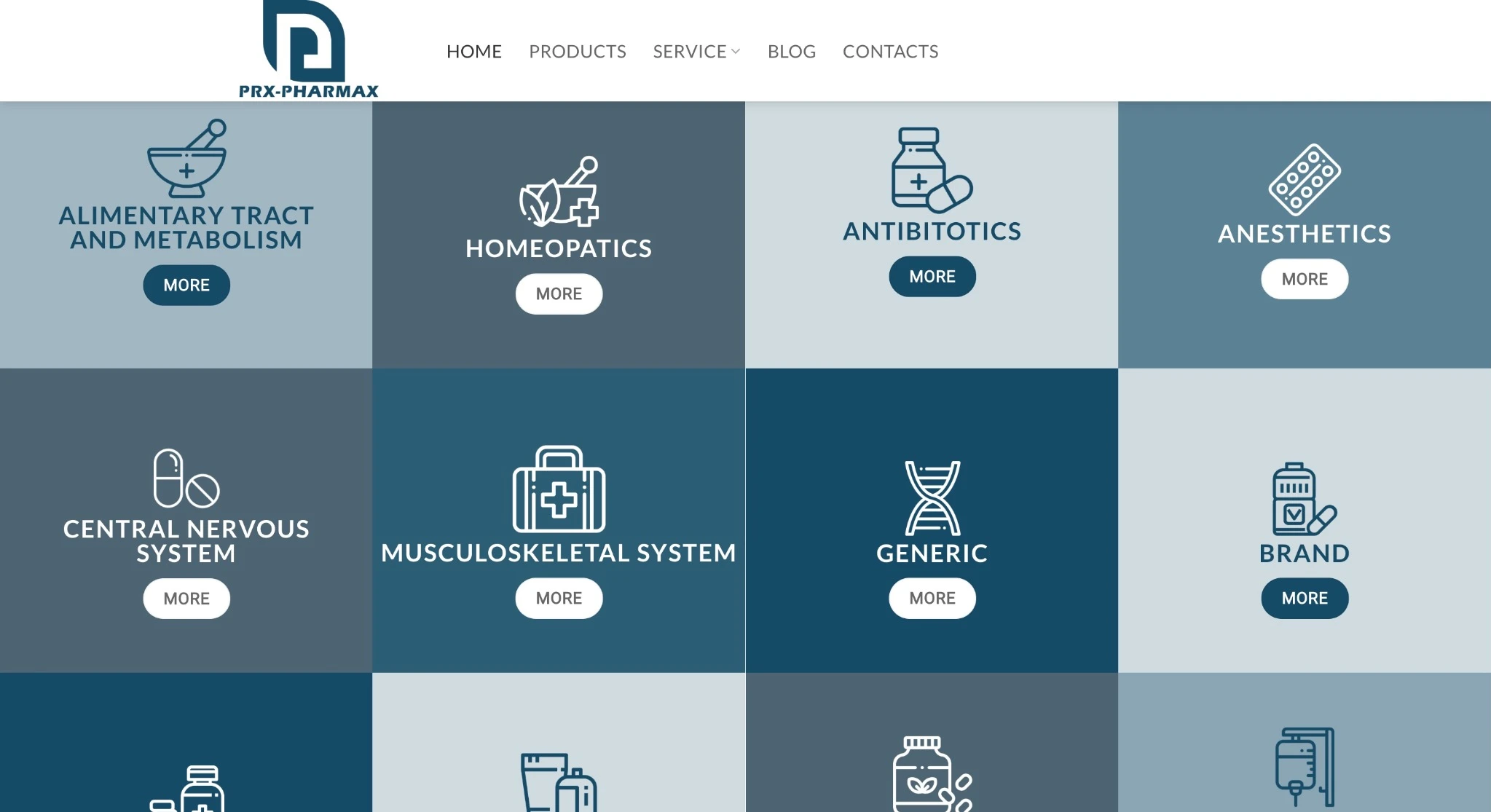
On the home page, below the main image, there is a grid of product groups: each group has its own icon, name and a “More” button that leads to the group’s description. This way sixteen groups can be shown at a glance, and visitors immediately find the area they need. In the project screenshot, they include, for example, Antibiotics, Vaccines, OTC and Health supplements.
Tiles of the same format let visitors browse the groups quickly: they look at icons and names rather than reading long texts. The detailed description is on a separate page, so the home page does not get too long.
If a similar website is planned for a pharmaceutical company or another distributor, it is worth agreeing at the start on one format for all groups: a short name and icon for the tile and a longer description for the group page. Then a new group can be added without changing the home page layout, and the grid stays uniform even as the number of groups grows.
Country map and services
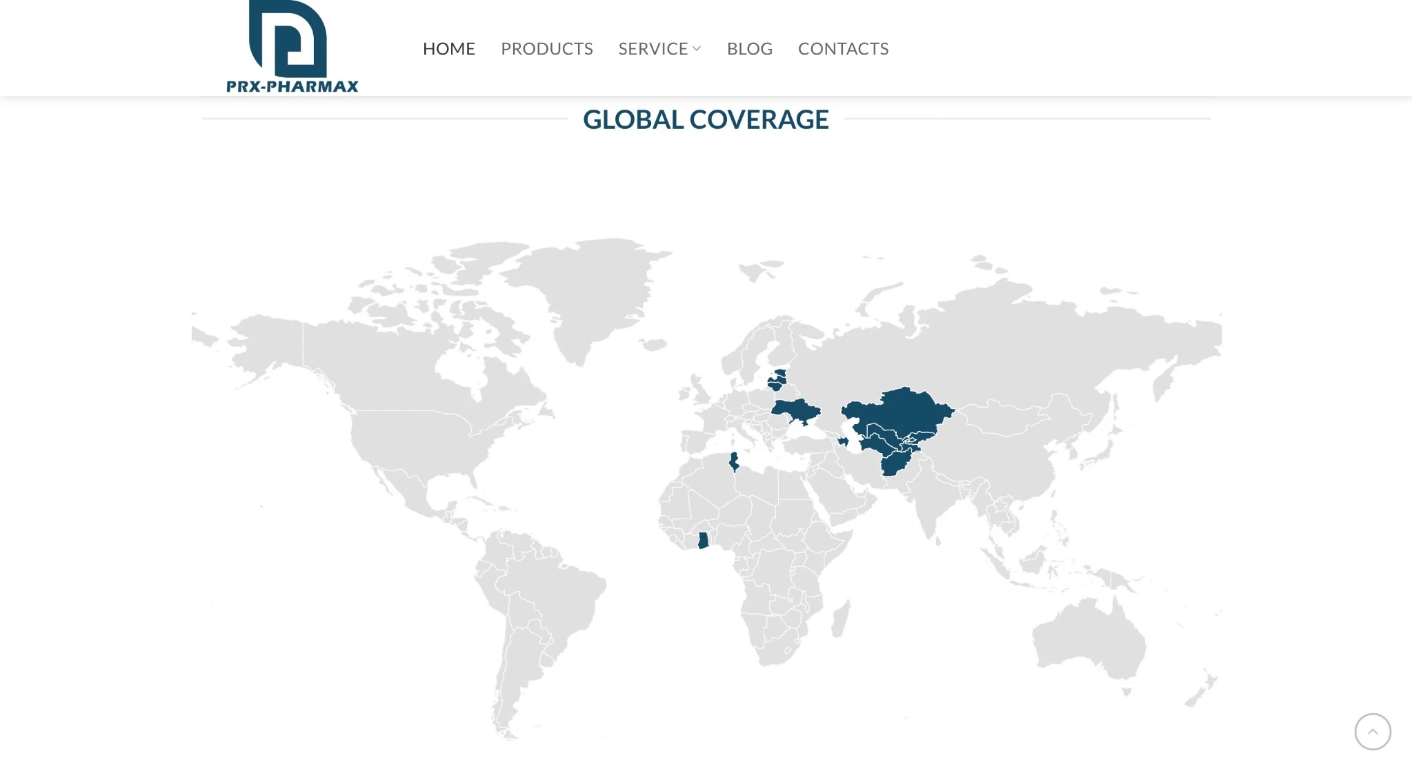
The “Global coverage” block has a world map highlighting the countries in which the company operates. An international partner sees on the home page itself whether the company works in their region. The map shows this information at a glance: partners find their country by its location on the map rather than searching a long list of countries.
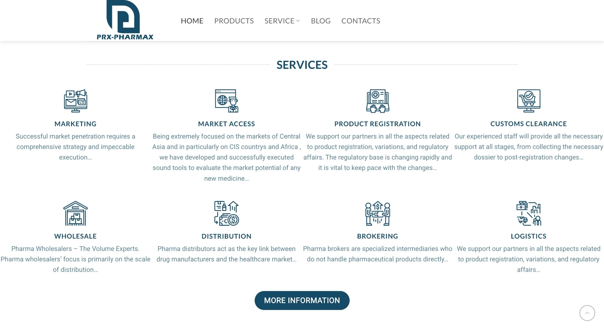
In the services section, eight areas — marketing, market access, product registration, customs clearance, wholesale, distribution, brokerage and logistics — are shown with icons and short descriptions, and a “More information” button leads to more detail. Services are shown separately from product groups, because a partner may need not a specific product group but, for example, help with product registration or customs clearance.
A contact form with country and area of interest
In the contact section, the left side has expandable explanations of four areas of cooperation: wholesale, distribution, brokerage and logistics. On the right there is a form in which an interested party gives their name, email, phone number with country code and the country they are interested in, and ticks one or more areas of interest. The phone field with a country code matters for international communication, because the number is understandable regardless of which country the person is in. The option to tick several areas is useful for partners interested in several types of cooperation at once.
The expandable explanations let visitors read about an area of cooperation right next to the form without leaving the page, while in their closed state they take up no space.
The form is protected by a reCAPTCHA check — a Google tool that helps tell a form filled in by a person from automated spam submissions.
An interested party’s journey on the website is short:
- on the home page, they choose a product group and open its description;
- on the map, they check whether the company operates in their region;
- in the services section, they read about the type of cooperation they need;
- in the form, they give their country and area of interest and send the enquiry.
Why this structure
A distributor’s clients and partners are companies in different countries, and they look for specific answers on the website: whether the product group they need is there, whether the company works in their country and what cooperation it offers. That is why each of these answers has its own block rather than one long text, and the contact form asks for exactly the data needed for the first reply.
Design and use on a phone
The visual design was our work. A lot of information is divided into uniform blocks with icons — product groups, services and areas of cooperation — so the page stays easy to scan even when there are many groups. The website is adapted for use on desktop and mobile devices, so the product groups, map and contact form can also be used on a phone. On a phone, the expandable explanations in the contact section are especially useful: visitors open only the explanation of the area of cooperation that interests them and fill in the form right there.
News
In the Blog section and the home page “Latest news” block, company and industry news is published with a date, an image and a short introduction. The company adds news itself in the WordPress admin. Because the latest posts are also visible on the home page, visitors notice them without opening the Blog section.
Technologies
WordPress website development here meant that the company manages the content itself: product group descriptions, services and news can be added to in the WordPress admin panel. On a single-language website, each description is updated in one place.
Who this kind of WordPress website suits
A website like this for a pharmaceutical company or another international distributor suits cases where many product groups and services need to be shown and enquiries received from different countries. It also suits a logistics or wholesale company whose offer divides into several types of cooperation.
To start a similar project, take a look at our website development and web design services.
Services we used
Website
Note
This portfolio entry reflects the solution as delivered at handover. The current website may have changed.